"Unashamedly contemporary" pavilion designed for Old War Office site in London
UK architecture studio DaeWha Kang Design has designed a pavilion and courtyard for The OWO hotel at the site of the former Old War Office in Whitehall, London.
The pavilion is located in front of the 1906 Grade II*-listed building, designed by architect William Young, that was once used by the British government's military departments.
The café pavilion sits in the courtyard of The OWO hotel in London
© Kyungsub Shin
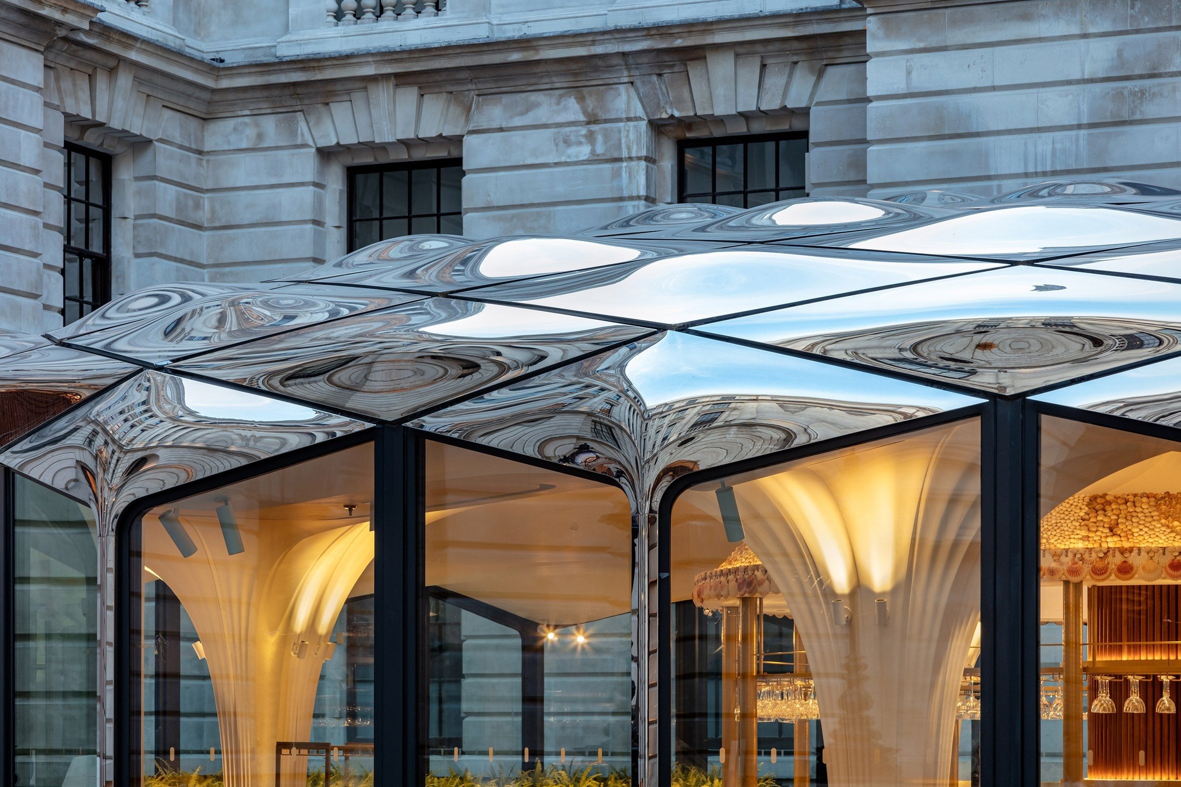
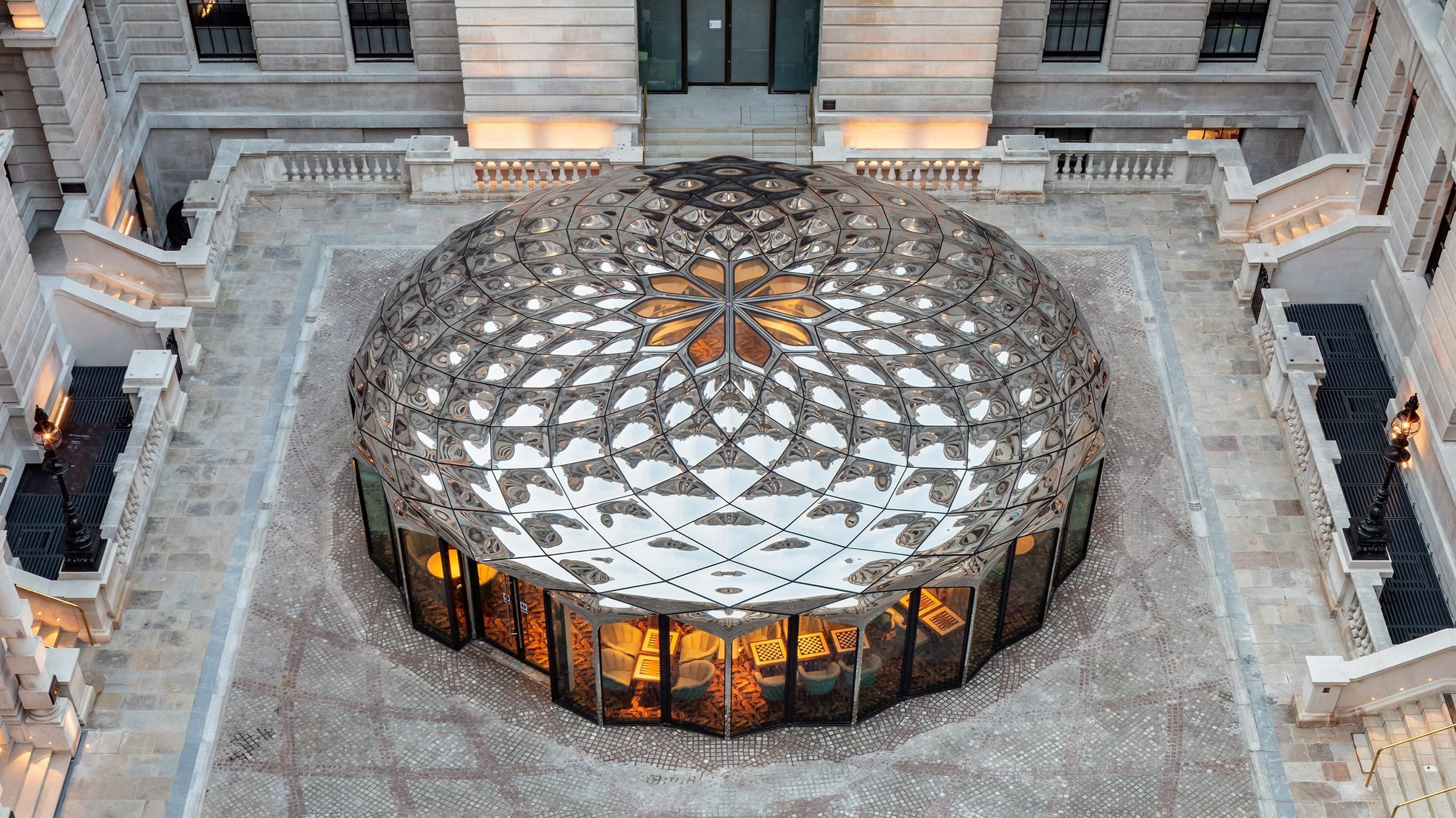
The prefabricated circular pavilion, which contains a bar and dining space for the Parisian restaurant Café Lapérouse, has a crafted glass facade and mirrored stainless-steel roof panels.
"The pavilion is unashamedly contemporary in its styling, but has much of the expressiveness and intricacy that we are accustomed to seeing in heritage architecture," DaeWha Kang Design said.
The circular pavilion is made of glass and stainless steel
© Kyungsub Shin
Due to the site's historical context – as well as being the home of the Old War Office, it is also where the Palace of Whitehall once stood – the studio was conscious of finding a balance between the new and the old.
"It was important for the design to enhance rather than compete with the existing historical architecture," the studio explained.
DaeWha Kang Design intended to find a balance between new and old
© Kyungsub Shin
"William Young's stone facades have a monumental, hard expression that projected Britain's power as the Old War Office," said the studio.
"One hundred years later, we are opening up Whitehall to visitors, and our design adds softness, fluidity, and tranquility to balance what came before. The pavilion is as much a sculptural piece as it is a building within the courtyard."
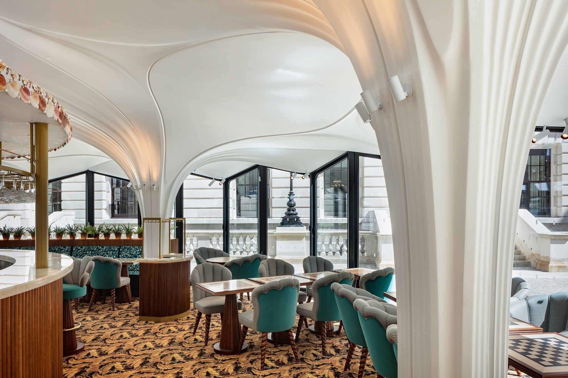
Housed inside is a bar and dining area for Parisian restaurant Café Lapérouse
© Kyungsub Shin
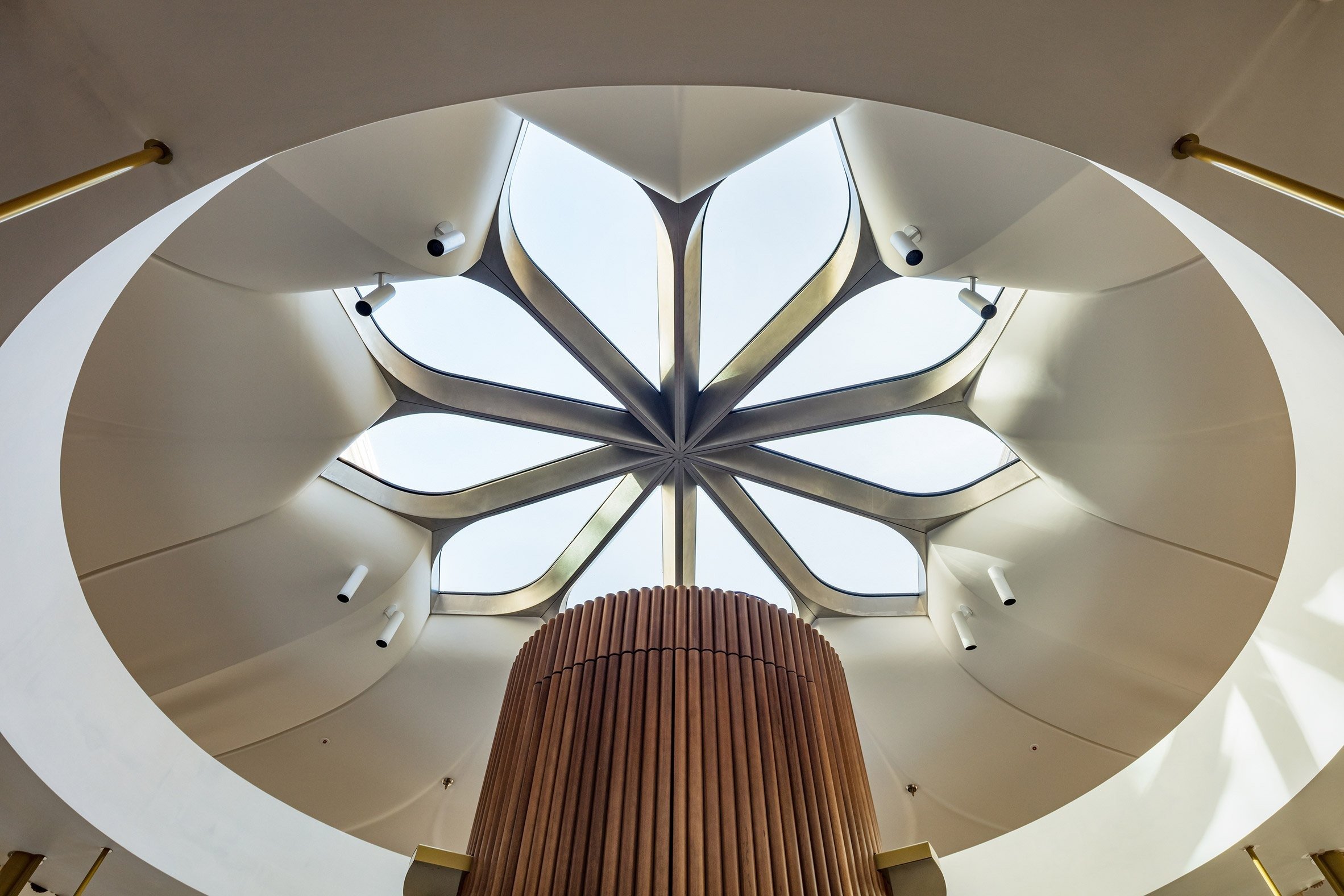
Inside the pavilion, a circular bar at the centre of the space is topped by a floral-shaped sculptural skylight. Ribbed white columns have been interspersed throughout the dining area.
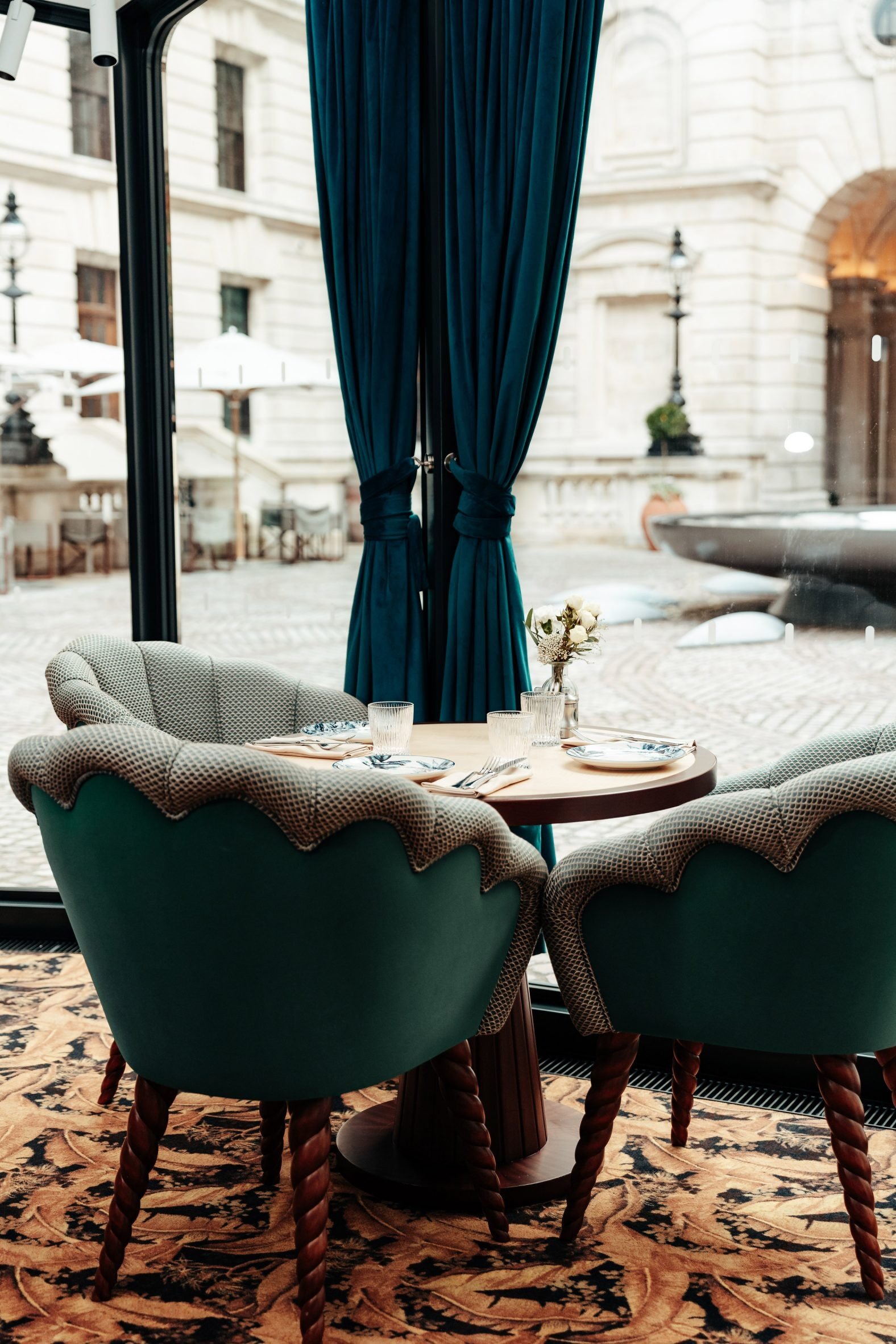
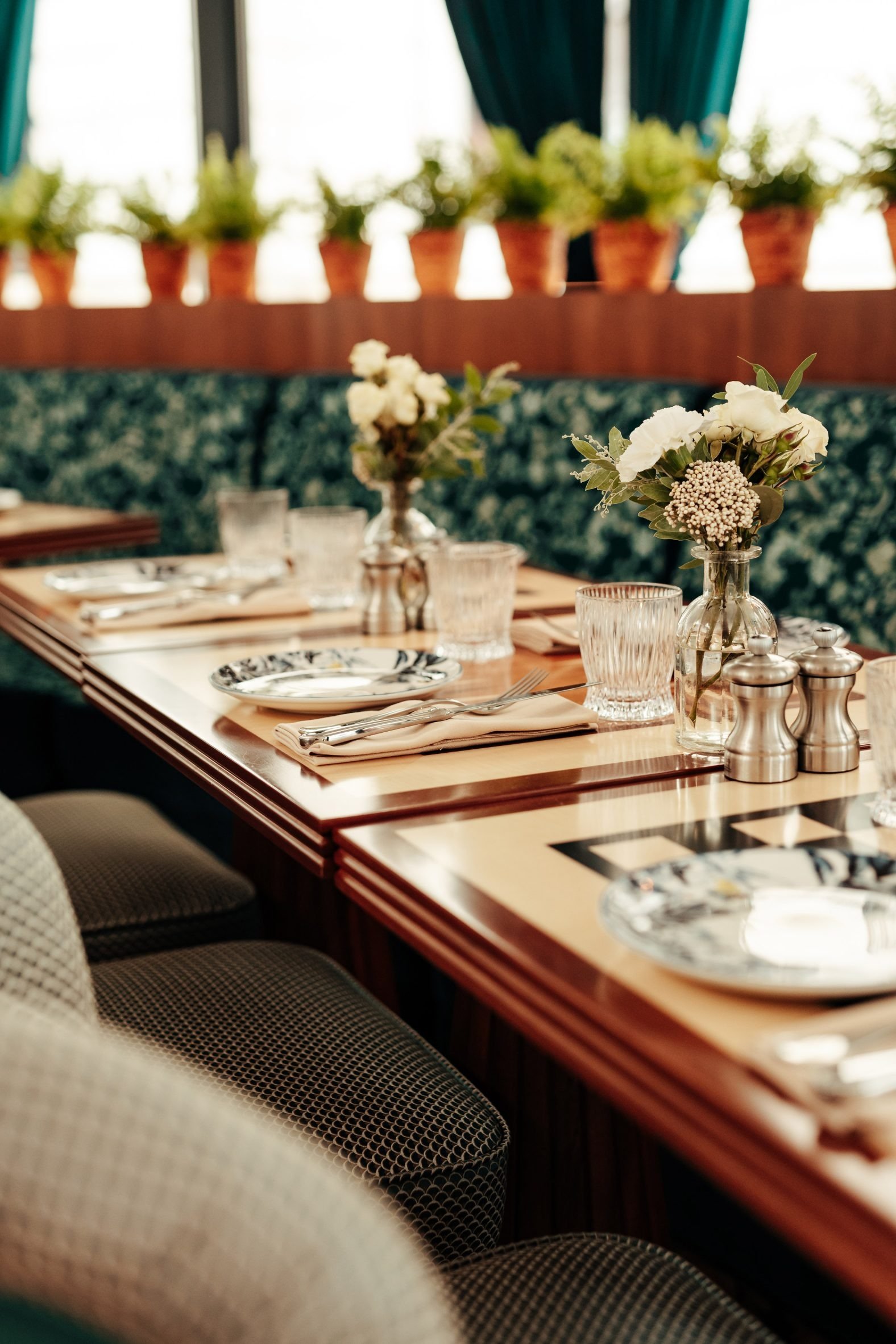
The interiors, which feature blue chairs and curtains, checkerboard tables and patterned carpets, were designed by Dior Maison creative director Cordelia de Castellane.
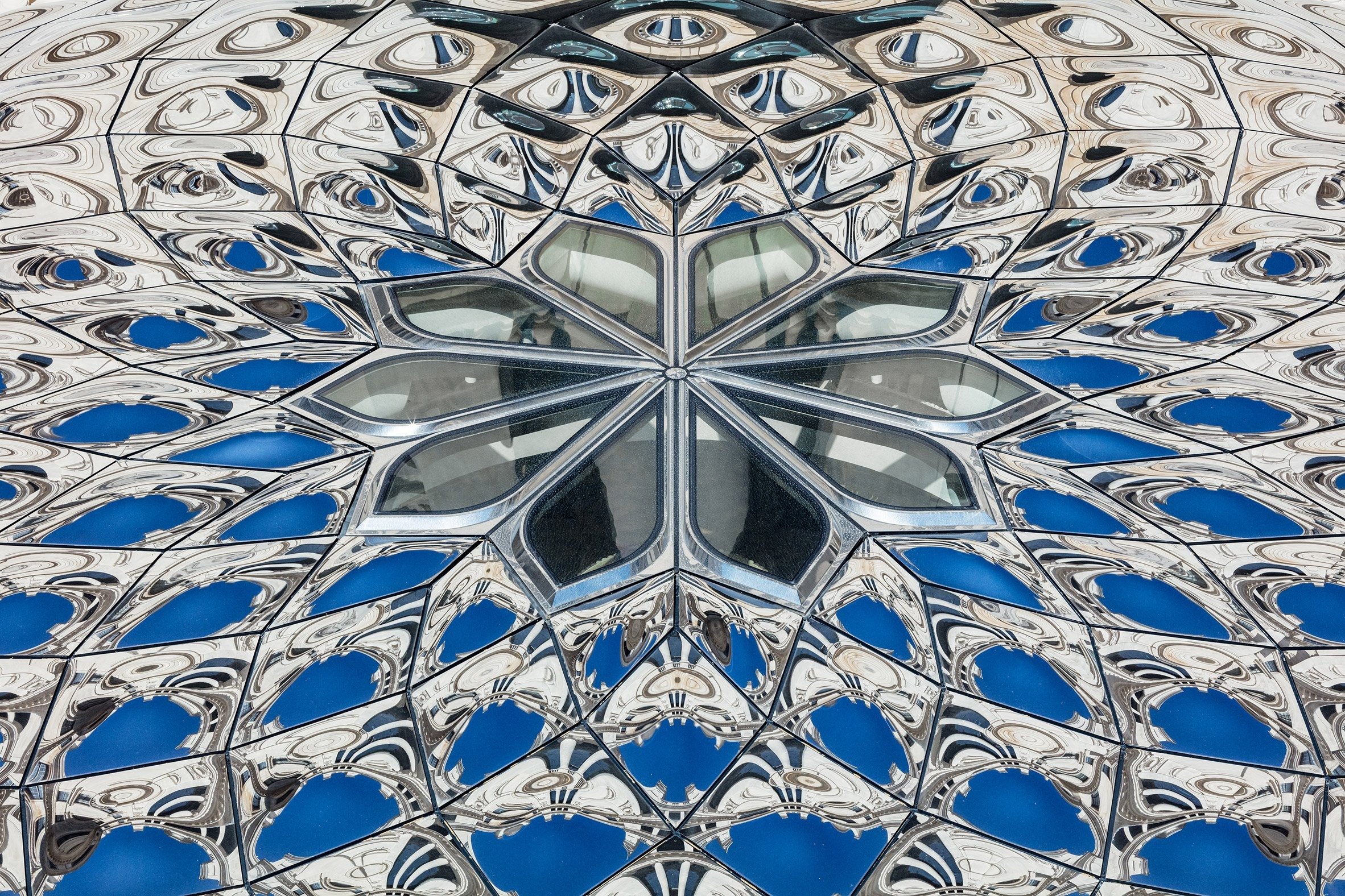
A sculptural skylight sits at the centre of the pavilion roof
© Kyungsub Shin
According to DaeWha Kang Design, its overall concept for the design of the pavilion aimed to evoke "the feeling of being inside a Georgia O'Keefe painting".
When selecting materials for the project, practicality and longevity were central to the studio's approach.
The pavilion is a prefabricated structure that can be easily assembled and dismantled
© Kyungsub Shin
"The mirror roof panels were made using an innovative liquid pressing technique by Fielitz fabrications in Germany, which require moulds on only one side to produce panels, reducing both the materials and energy used for fabrication," DaeWha Kang Design explained.
"Mirror stainless steel is a very robust and easy-to-maintain material."
A fountain was incorporated into the design for the courtyard
© Kyungsub Shin
Another key consideration was to make the pavilion "according to circular design principles", the studio said. It designed the building so that individual parts could be either mechanically fixed and replaced, or recycled at the end of life.
DaeWha Kang Design also created the prefabricated pavilion so that it could be easily dismantled and reassembled if needed.
Existing cobblestones were preserved and reconfigured
© Kyungsub Shin
A five-metre sculptural fountain designed by the studio is located in front of the pavilion, with the pattern from the rippled metal roof reflected onto the water.
"We envisioned the pavilion to have a mirage-like presence with its fluid reflections, and the fountain adds an oasis element to the place," said the studio.
"In our design, the pool is the yin to the yang of the pavilion. The interplay of real water and reflected metal waves creates a dramatic and dynamic experience".
© Kyungsub Shin
DaeWha Kang Design also reconfigured the existing cobblestones in the Old War Office courtyard into a new floral pattern, which repeats throughout the project.
The stones were carefully documented and relaid due to their historical significance.
© Kyungsub Shin
© Kyungsub Shin
"The cobbles are the original stones that Winston Churchill walked on every day on the way to work," explained DaeWha Kang Design.
"At the suggestion of Historic England, we have relaid them in a new pattern that embeds the pavilion and the fountain into a complete composition within the courtyard."
© Kyungsub Shin


