Podpunkt’s rebrand for National Museum in Kraków is guided by weaving
The visual identity will house the Museum’s 12 distinct branches by threading a set of custom symbols into the MNK logo.
The Warsaw design agency Podpunkt has rebranded one of the largest museums in Poland, Muzeum Narodowe w Krakowie (National Museum in Kraków). The new identity is based on the concept of weaving together inspirations and artworks to form the basis of a vast collection of art.
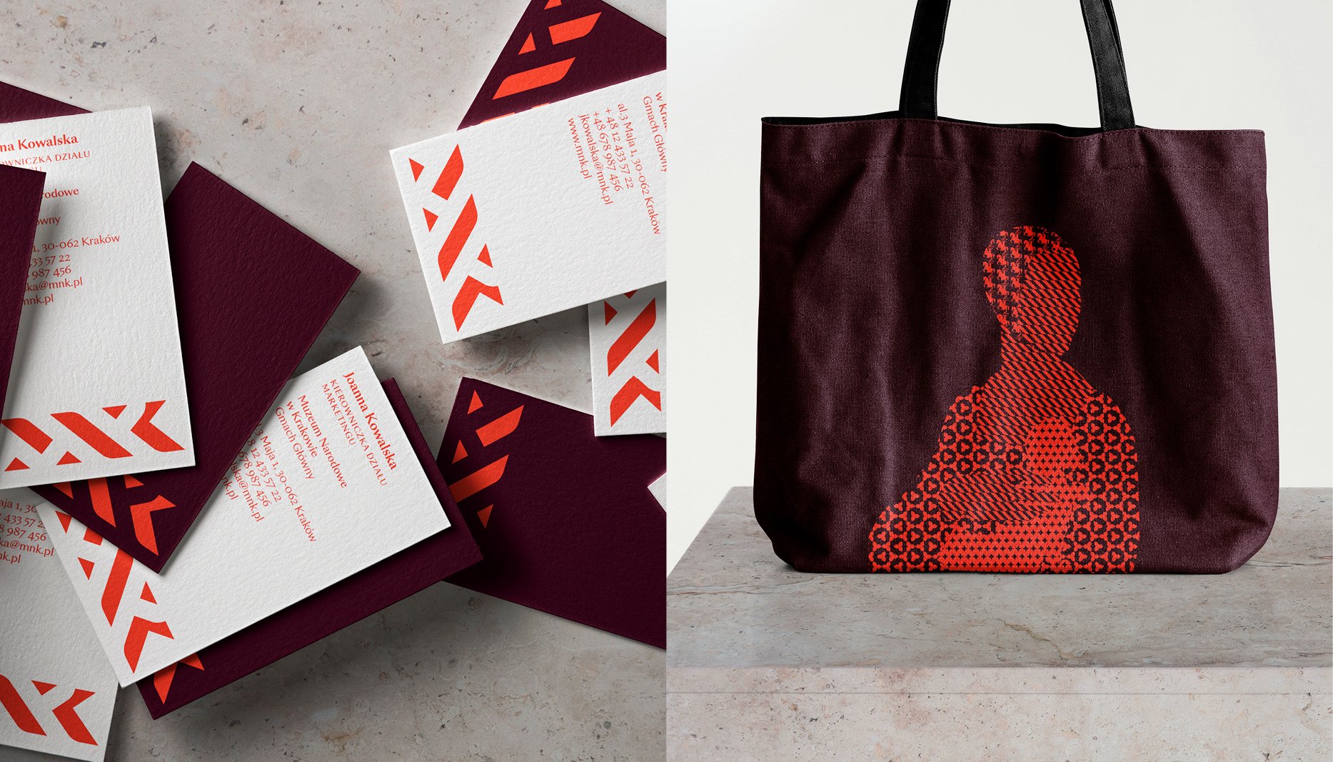
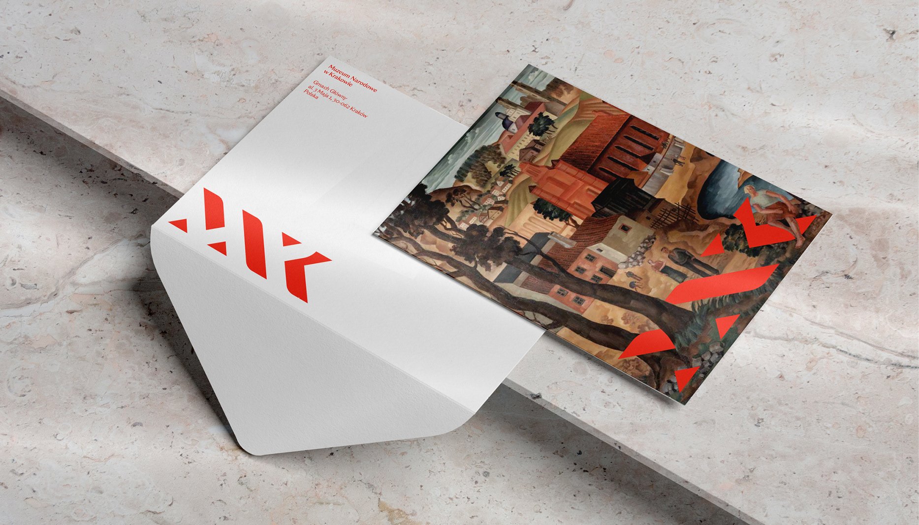
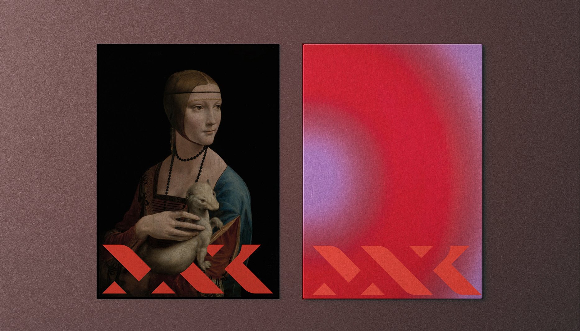
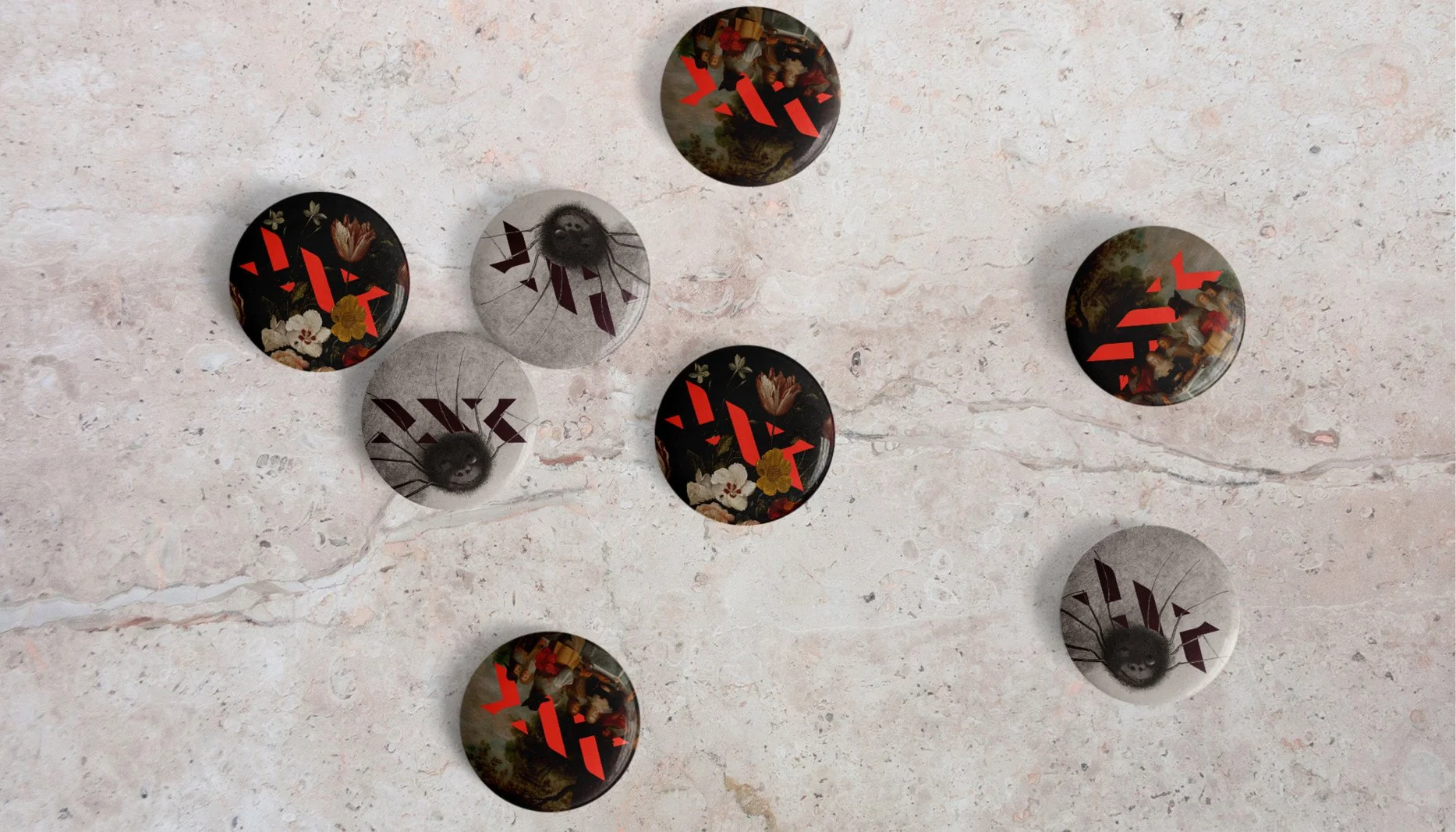
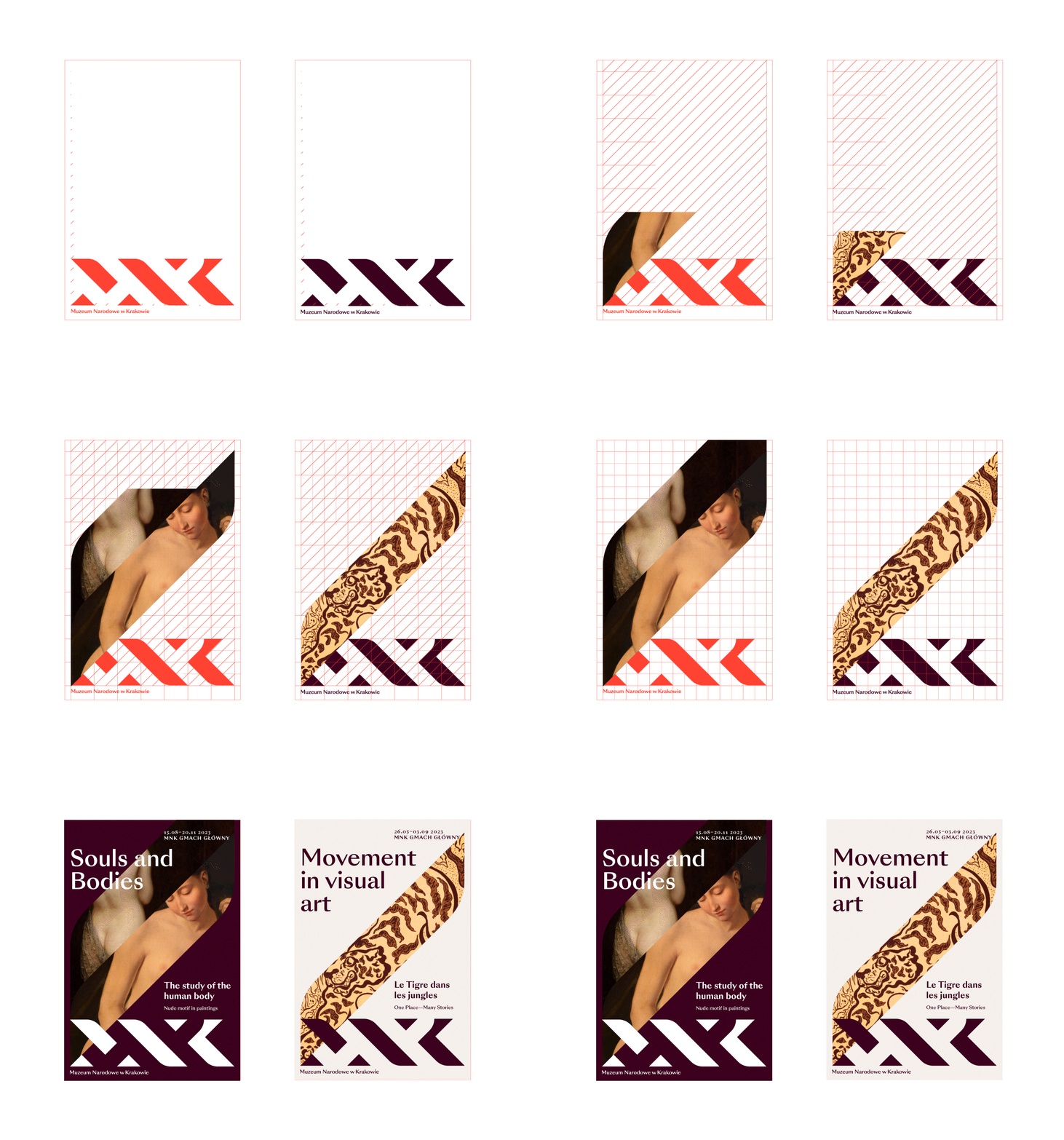
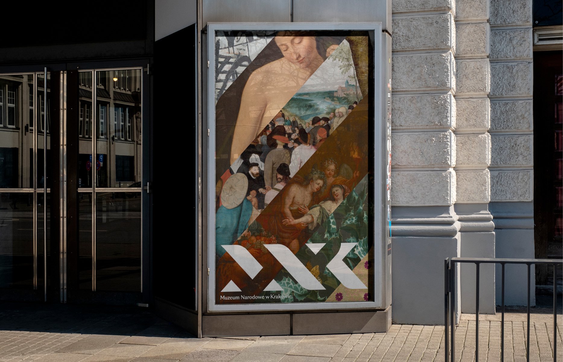
Like previous logo variations, the new brand uses the abbreviated name of the Museum – MNK – as the basis. This time however, Podpunkt has harnessed negative space to create a geometric interpretation of entwined threads and “classical typography”, the studio explains. While all the letterforms are represented in a grid system, elements of each glyph fall away in the new logo to create the effect of weaving, with lines overlapping and falling in and out of view. This symbol appears to be intertwined with artwork in the Museum’s collection, with figures from paintings appearing to interact with the mark.
“Creating a new visual identity for the Museum was a challenge in many ways,” says Podpunkt. The agency endeavoured to create a look that was timeless, not denoting one particular style and period, but that could also flex between all 12 branches of MNK. These include houses and museums dedicated to permanent collections as well as the Museum’s main building.
Podpunkt: National Museum in Kraków ( © Podpunkt / National Museum in Kraków, 2023)
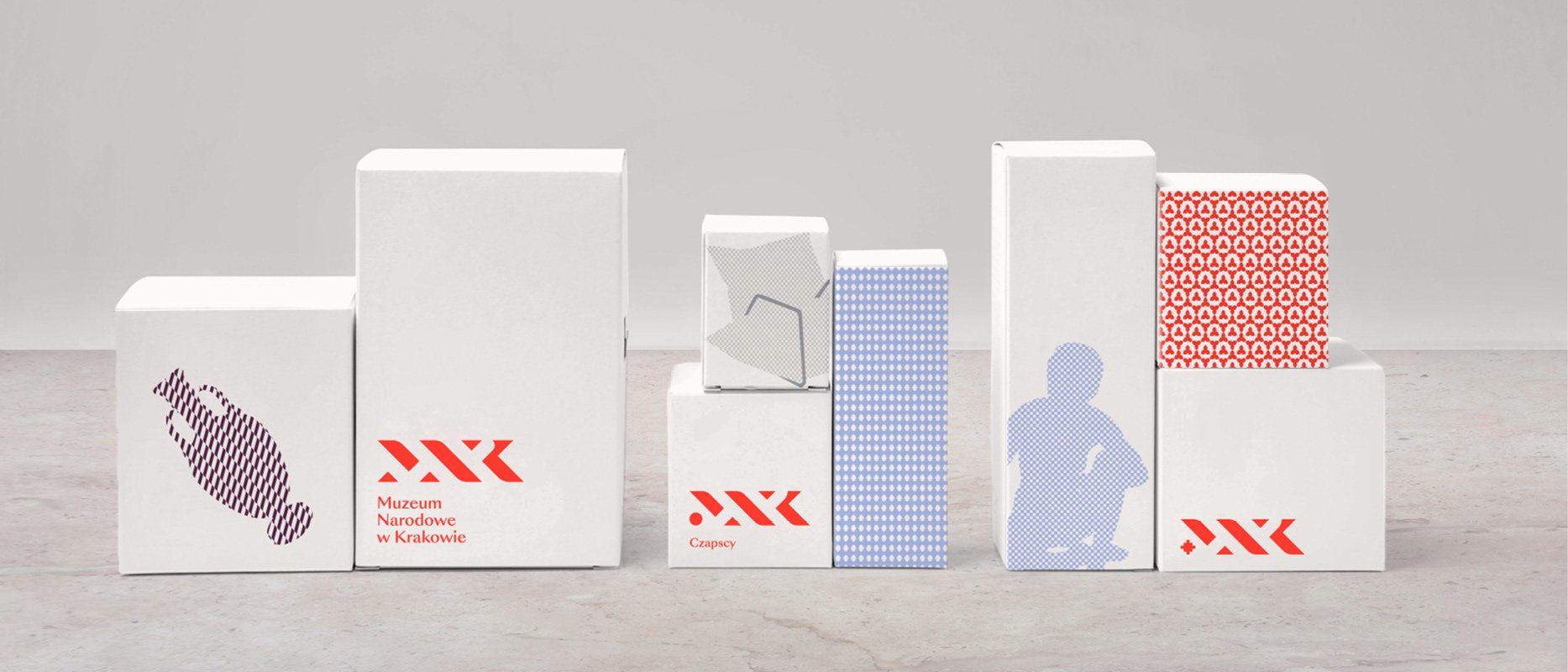
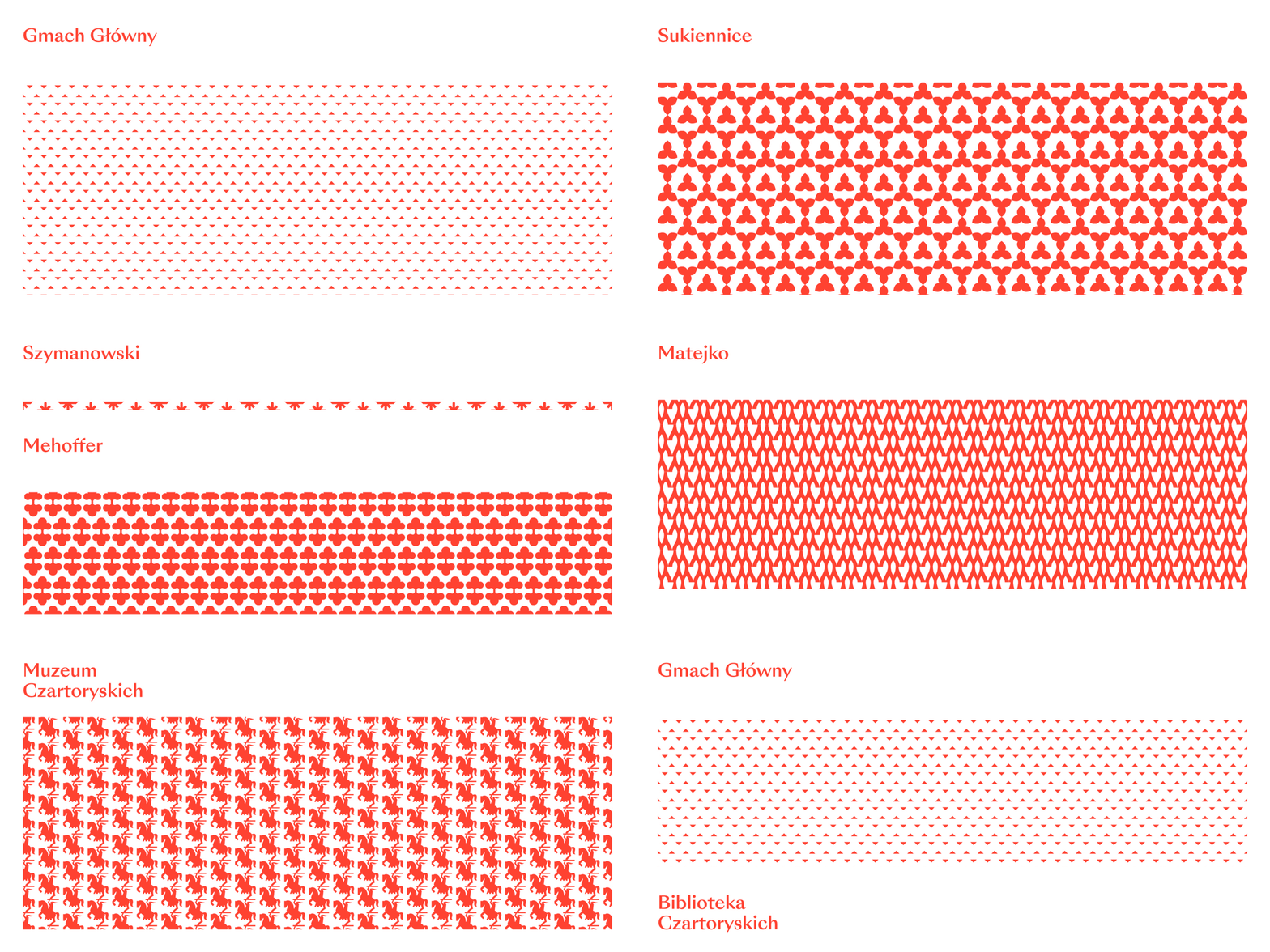
While these branches were previously known under a variety of names, Podpunkt has now introduced a unifying naming system where each is connected under the MNK umbrella. A clever corresponding design system has also been introduced to mark this shift; a range of icons now represent each arm of the museum, inspired by the art or building of the branch. These icons can interchangeably replace the first serif of the MNK logo when indicating a specific branch in brand communications.
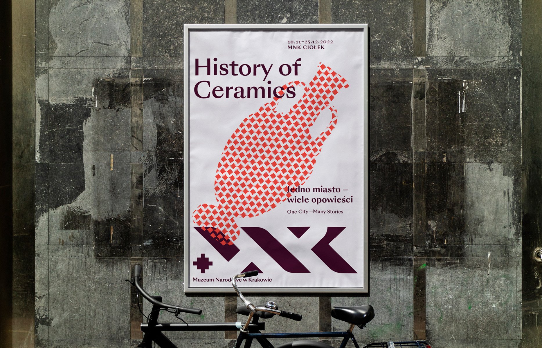
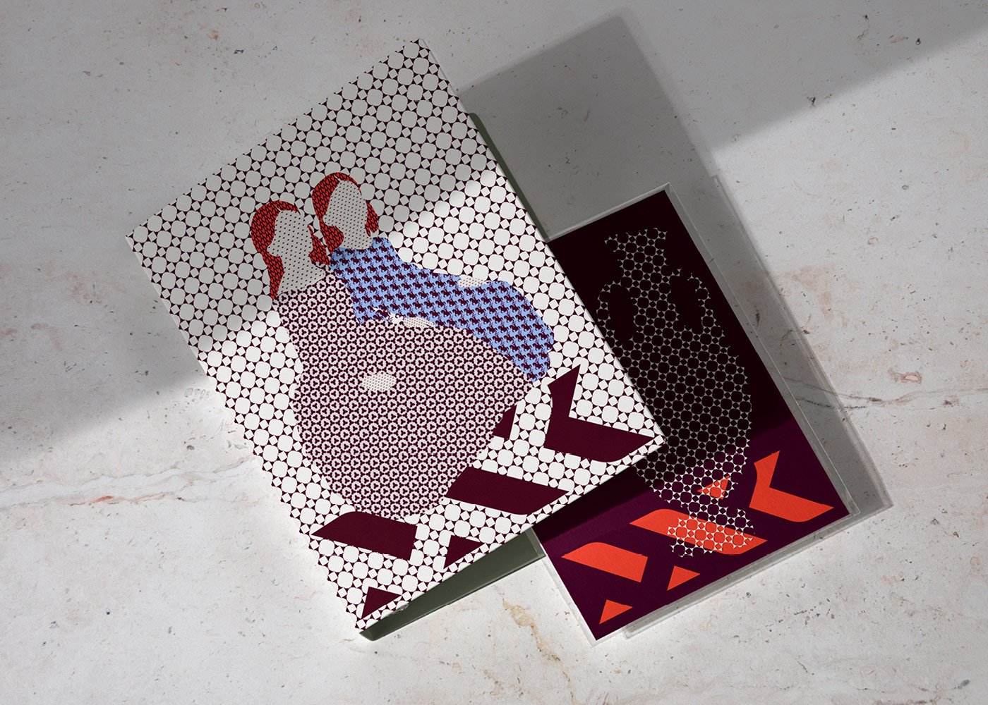
Another central element is the illustration style, which continues the weaving theme through a tapestry motif. These are formed by repeating rows of MNK branch icons and crop up in MNK merchandise and exhibition posters. Typography is based on Swiss Typefaces’ Sangbleu which Podpunkt shares is at “once classic and modern”.
Podpunkt: National Museum in Kraków ( © Podpunkt / National Museum in Kraków, 2023)
