Limited Palettes and Forms Define Molly McCammon's Style, but There's No Limit To This New Illustrator's Potential
Just two years into her career, Scottish illustrator Molly McCammon has established a calm, sophisticated style which is impressing clients from around the world.

© Molly McCammon
When you're a young creative, stepping away from something you trained hard to do can be daunting. But it's a leap Molly McCammon took two years ago, and it has paid off in spades. Originally, the illustrator's dream was to create picture books, but soon after graduating from her MA at Cambridge, she felt a need to evolve further as an artist and explore a broader range of commercial projects.
This brave move has certainly paid off, and today, she has a client list that includes Red Bull Media's Carpe Diem magazine, the Australian style magazine Frankie, and organisations in the pet care, renewable energy, and music industries. Her distinctive style – with its simple, impactful forms, subtle palettes and textures, and light, easy-going tone – has an increasing number of suitors.
"The Picturebook Illustration programme at Cambridge definitely informed my understanding of simplicity," says Molly as she explains the origin of her style. "I developed a deep appreciation for mid-century picture books, where the limitations of printing methods necessitated the use of limited colours and printing layers. This often resulted in simpler shapes, designs, and the effective use of negative space – a technique I experimented with in my own work."

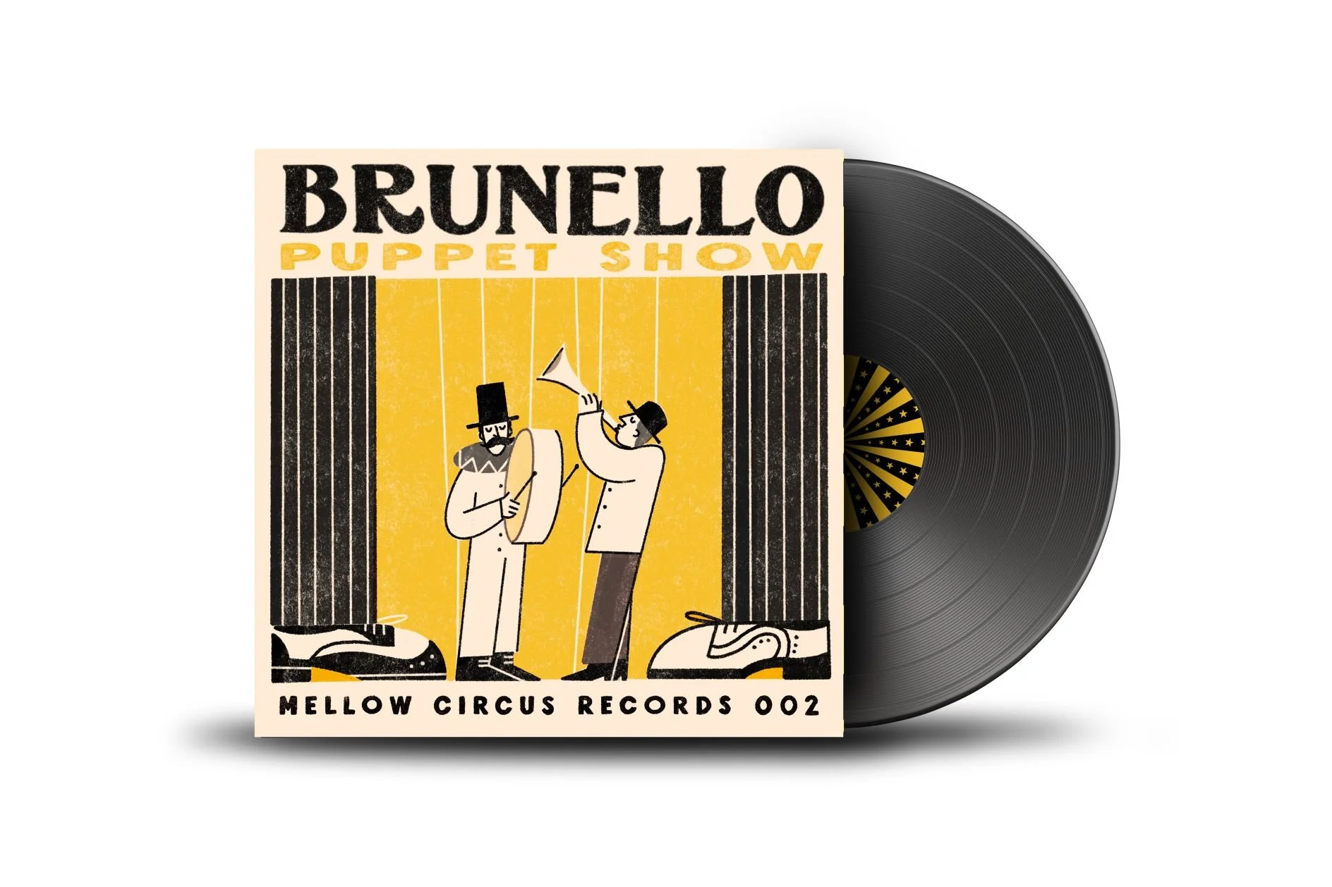
© Molly McCammon

© Molly McCammon
Molly's ability to pare back the details and refine a piece down to something clear, characterful and visually appealing is just one of her assets. Another is that she's quick to develop concepts and bring solutions that help art directors achieve their aims. The wonderfully tranquil set of images she created for The History of Greenthumbing article in Frankie magazine is a case in point.
The brief was for three illustrations – an English country garden, a Japanese garden and a topiary garden, with details including a bridge, pagoda, moss and ponds. And all with a very tight deadline. "Since the text for the English country garden and topiary garden spanned a double-page spread, we discussed merging these two concepts into one larger, impactful illustration. I also proposed adding an illustration of a crane in flight to the title page to balance the impact of the spread," says Molly.
© Molly McCammon

© Molly McCammon

© Molly McCammon
Influences for Molly range from mid-century picture books and matchbox art to classic illustrators including Miroslav Sasek, Bernice Myers, Alain Gree and Alice and Martin Provensen. More recently, she has developed a taste for contemporary illustrators such as Virginie Morgand, Leo Espinosa, Owen Davey, Iker Ayestaran, Mar Hernandez and the brilliant Malika Favre.
A constrained colour palette is a thread connecting many of these artists to Molly and her style. However, it also sets off a little tension with what she calls her superpower. "I have strong synaesthesia, where my brain associates colours with numbers, letters, smells – even days of the week and months of the year," she says. "It can be a superpower in many ways; however, having the entire colour spectrum at my creative disposal often felt overwhelming. Limiting my palette offered a surprising amount of freedom and calm, making the design process far more enjoyable."
Even when you're used to finding the right concept and refining the forms to suit, sometimes it's hard to nail the composition. When this happens, an illustrator should never be afraid to refer to the greats, as Molly demonstrated with the wine labels she recently illustrated for her friends' wedding.

© Molly McCammon

© Molly McCammon
Five designs were requested to depict activities bespoke to the happy couple, including getting married (naturally), going to the countryside, walking the dog, enjoying date nights, and gaming. There were no mandatories to worry about like a brand, crest or the ABV of the liquid, but the portrait aspect of Molly's first wine labels gave pause for thought. "I struggled to get the gaming and date night illustrations to work," she says, "I couldn't see those activities as anything but horizontal. I looked back into some of Picasso and Braque's cubism work to loosen my compositions and preconceived ideas, and finally resolved all five illustrations to be succinct and consistent."
At the time of writing, Molly's next project is in production – a commission to illustrate Carpe Diem's guide to modern etiquette. In the middle of the timeline, there was the small matter of Molly's own wedding, but thankfully, Red Bull Media has been more than understanding. Going forward, Molly would love to step up and work on a major advertising campaign. It's a long way from illustrating picture books, but now that she's finding commercial success, she isn't ruling out a return to publishing. "I would love to illustrate a non-fiction book on ancient culture," she says.