Archive uses sustainable wood in its structure to provide flexibility in disassembly
In 2023, a project called “Archive | Qiao” was invited by Design Anthology to be exhibited in Shanghai. Design Anthology is a magazine that combines design and art, and can be seen as an archive itself. The theme of the invitation was “Archive,” and the aim of our project was to extract inspiration and express design concepts from the magazine. To achieve this, we constructed a dynamic and sustainable exhibition hall that mimicked flipping through the magazine’s pages. The exhibition was open for four days.
© Xinghao Liu
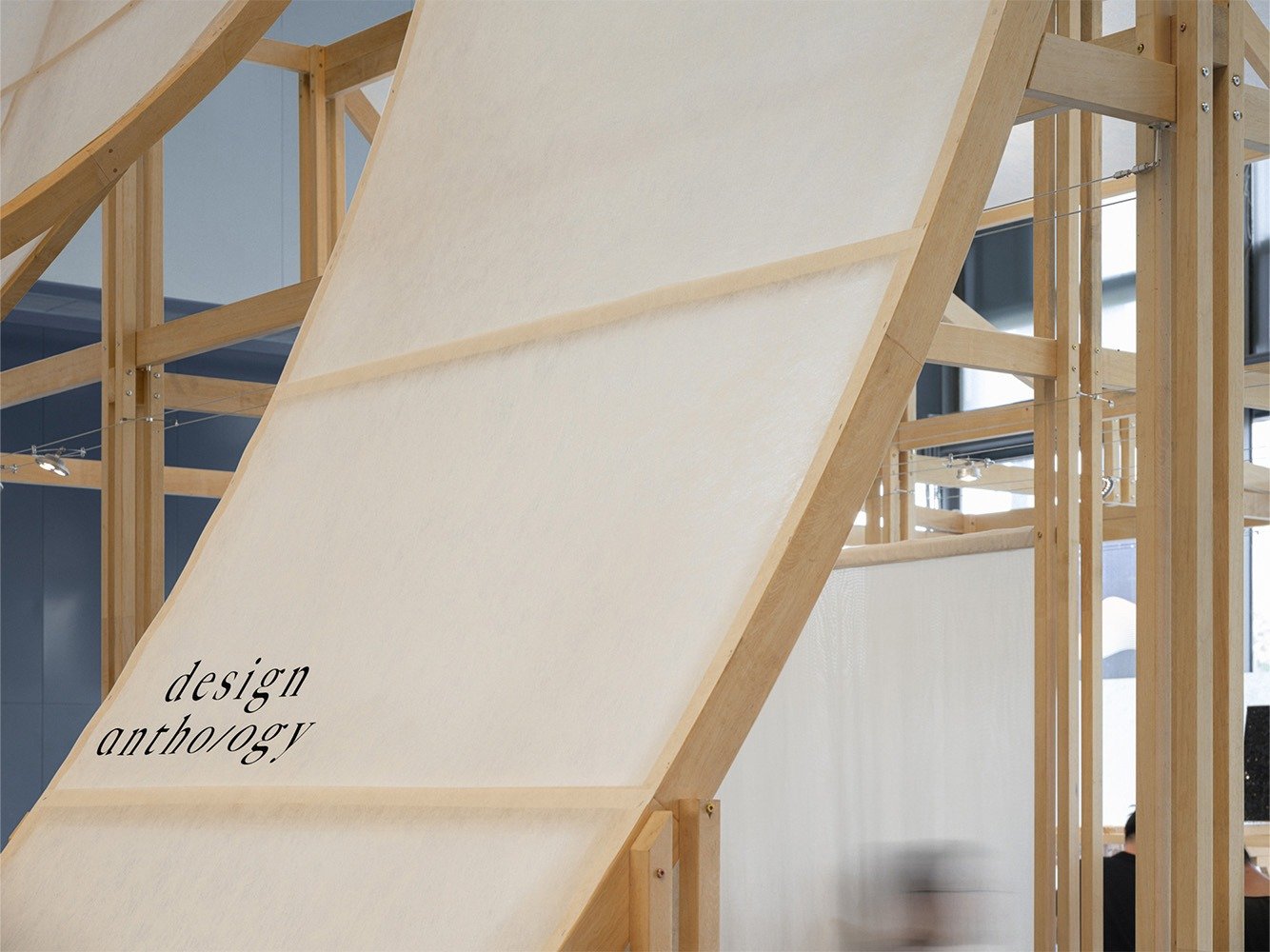
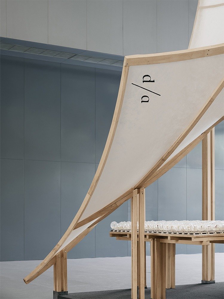
“At the entrance, a lifted-up shaped corner is like a page about to be turned. As visitors approach, they are able to immerse themselves in the “reading atmosphere” created by the space. Glimpsing through the cracks evokes a sense of exploration and curiosity, while also corresponding to the understated elegance that is a unique feature in traditional Chinese architecture and culture.” states Tommy Yu, “The scattered artworks throughout the area ensured that visitors experienced different surprises at each branching point of their journey through the exhibition.”
© Xinghao Liu
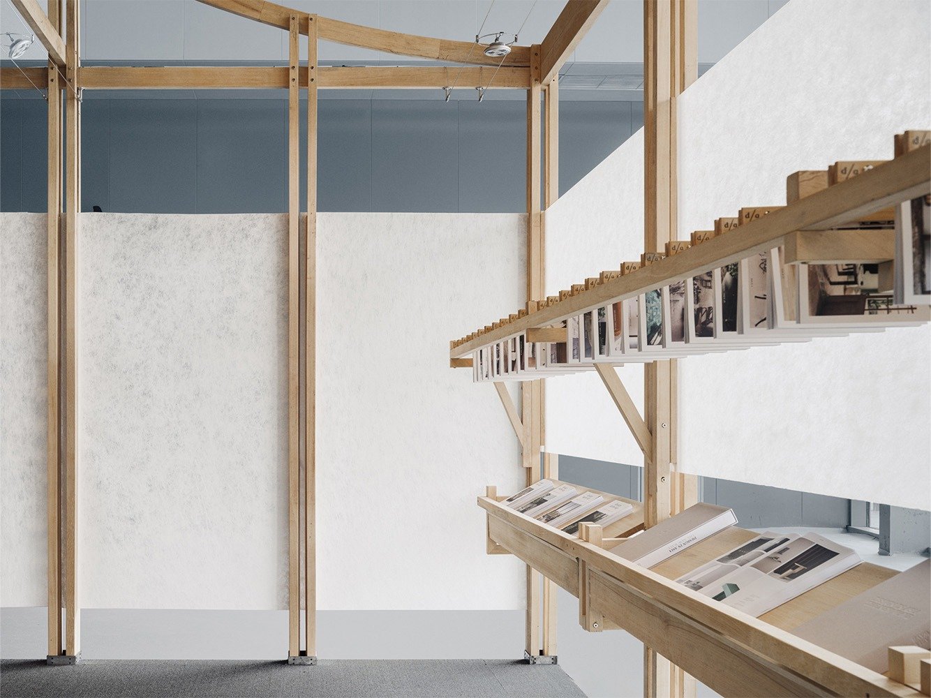
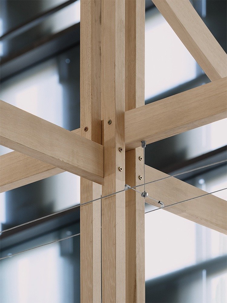
The main structure of Archive is constructed using wood, a sustainable natural material. This approach results in a holistic construction that combines traditional architectural techniques with contemporary design. This practical approach provides a feasible method for flexible dismantling, rapid transportation, and multiple cycles of use in the future.
© Xinghao Liu
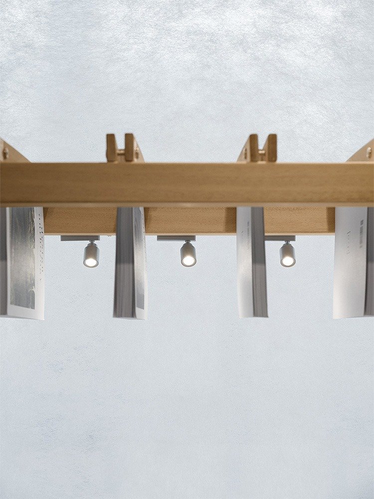
To enhance the building’s sense of lightness and transparency, we replaced traditional hanging light fixtures with light lines concealed in woodworking grooves, presented alongside traditional woodworking structures.
© Xinghao Liu
“In the spatial circulation planning, we have divided the space into different sections with various content and presentation styles. Among them are displays of artworks and exhibitions from different artists, offering an immersive experience for visitors to browse and explore. When they further step into the space, they will come across a relatively independent area where previous issues of the Design Anthology magazine are displayed on traditional magazine racks, clearly organized and easily accessible.” states Yu.
© Xinghao Liu
Washi paper is used throughout the space to connect different modules and contents, making it a key element in space cutting.
“We draw inspiration from the character “翹” because it combines both form and phonetics,” states Yu.
© Xinghao Liu
One of the inspirations for this project comes from the character “垚,” which is derived from traditional architectural structures. It resembles three layers of soil and represents the beam and column structure in Chinese architecture known as dougong. Another inspiration comes from the character “兀,” which is taken from the shape of ancient building eaves and represents the shape of a roof.
© Xinghao Liu
© Xinghao Liu
The character “羽,” derived from the sound of “yao” in ancient texts, represents the long feathers of a bird and its light and graceful posture, which is echoed in the material used for the project. Finally, the character’s shape is derived from its meaning of being raised high, and its essence has transcended the original definition recorded in ancient books, reaching for something beyond and creating a sense of resonance and aspiration.
© Xinghao Liu


